AI Assistant & Interaction Patterns
Case Study
Problem Statement
“How might we bring AI further into our product to improve data quality, so that customers can trust and act on their data with more confidence, bundled with clear signals for when they’re interacting with AI and which data is AI-generated?”
Goals & my role
I led the design of the AI Assistant, the product's first major AI feature, working closely with our Design Lead for guidance and feedback throughout the process.
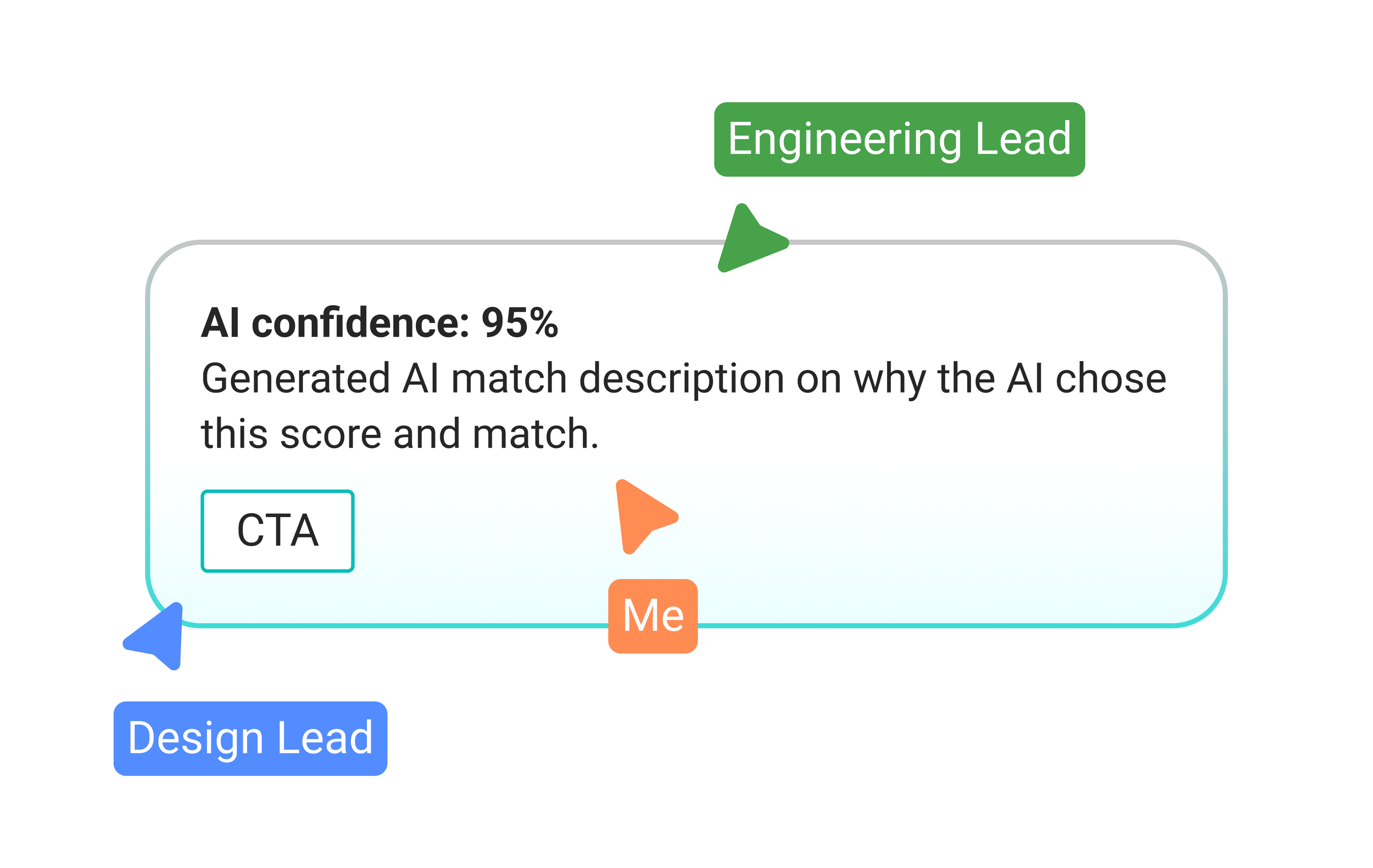
Once the Assistant shipped, more AI features started appearing across the product. Together with the Design Lead, I helped define a shared visual language for AI in the UI: which icons to use, how AI-generated content should be displayed, and how to clearly communicate things like an AI confidence score or a short explanation of why the AI selected a particular match. The aim was for every AI touchpoint in the product to feel consistent and trustworthy, and for that pattern to live in the design system so other designers could build on it going forward.

Target Users & their Problems
While working with large enterprise customers, our team kept running into the same recurring issue: key data points needed to calculate emissions were often missing from what a customer could provide.
Through further research and conversations with these customers, we identified the following problems:
Enterprise customers are frequently missing specific data points that are essential for accurate emissions calculations, simply because that data was never tracked internally or isn't accessible to them.
Manually researching or sourcing these missing values is extremely time-consuming, and often not realistic for the customer to do on their own, which stalls progress on the platform.
The regulations behind emissions reporting, and the platform itself, are highly complex. Most customers are not emissions or LCA (Life Cycle Assessment) experts, so understanding what applies to them and why quickly becomes a problem of its own.
The target group were enterprise customers working with large, complex datasets, people who needed to keep moving forward with their emissions calculations but were regularly blocked by missing data or an unclear understanding of the platform and its regulatory context. To keep them working efficiently instead of stuck, these problems had to be solved.
Research
Interviews
“Our data is way too massive to scan it manually. It would be great to have an assistant chat tailored to our data”
“We need to clearly see which data was AI generated and which wasn’t. A reason on why AI came up with the results would be helpful.”
“We are open to AI features and interested in them but still skeptical about the security of our data”
“Lots of departments are working together in the production. Through the different steps, accurate data like weights is being lost.”
User needs
-
Users needed a quick way to scan and make sense of their own data without digging through the platform manually. Beyond that, they needed a place to ask regulatory or product-related questions and get clear, immediate answers.
-
Enterprise customers often can't provide every data point required for accurate emissions calculations. Users needed a way to fill these gaps automatically, based on data and patterns we already had about them, without having to stop and manually track everything down first.
-
Whenever data is AI-generated, users needed to see this clearly and consistently across the product. This meant a shared visual pattern that shows not just that AI was involved, but why, including a confidence score and a short explanation behind each AI-generated result.
Ideation & Concept development
Ideation and concept development started with a foundational question for the AI Assistant: where should it live? Since it needed to be accessible from anywhere in the product, the navigation, always visible regardless of page, became the natural starting point.
From there, we explored a few directions: placing it prominently near the carbmee logo, positioning it near the profile area for a more personal feel, or moving away from the navigation entirely toward a floating bubble fixed to the screen. We also looked at how it should coexist with Intercom, at one point considering a combined pill button for both, an idea we later dropped since the Assistant wasn't meant to replace Intercom. On the interaction side, we prototyped both a side panel and a simpler floating pop-up before settling on a direction.
One of the biggest challenges was designing a single pattern that worked consistently everywhere in the UI, so users could immediately recognize AI involvement no matter where they encountered it.
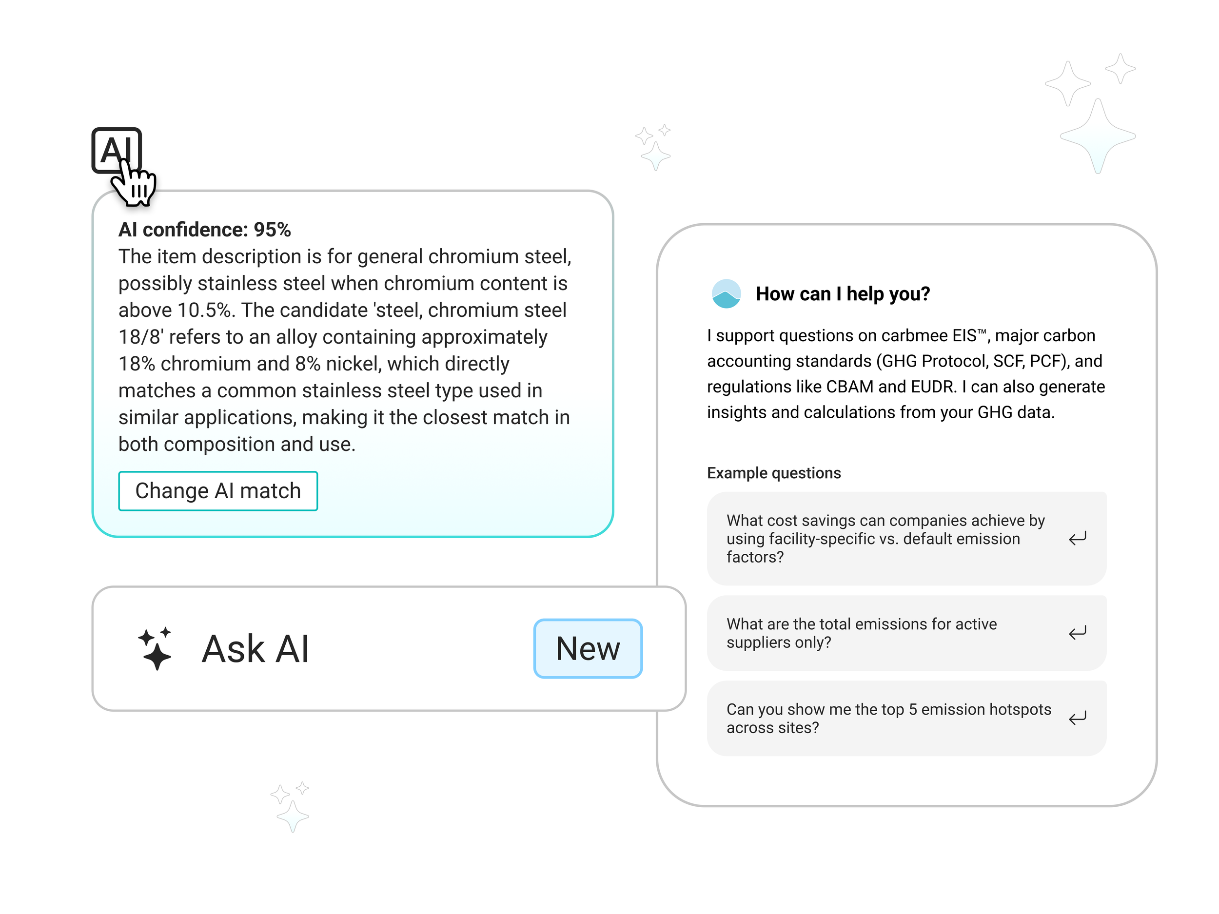
We started with a unique background and border gradient, inspired by what other products on the market were already doing, to visually set it apart from every other pattern on the platform. We first tried labeling it through an existing tag component, but ultimately chose a separate AI icon instead: more distinct, easier to recognize at a glance, and simpler to add to other components.
Combined with the gradients, this gave us a pattern that could scale across multiple formats:
Image elements, like cards
Toggle buttons
Inline content that AI had generated
Tables, simply by placing the icon in front of the relevant value
AI patterns in the product
After a lot of iteration, we decided to call it "Ask AI" and place it directly under the carbmee logo, top left, an area that's always prominent and easy to find, and one that also works cleanly in the navigation's collapsed state. For the interaction itself, we chose a panel that opens left to right, since it scaled best with our existing pages, was the simplest to implement, and kept the main screen visible on the right for reference. We also made the panel resizable in width, so users could adjust it to whatever they needed in the moment. It was the simplest and most scalable approach available to us.
One key interaction: hovering over the AI icon reveals the confidence score and a short explanation behind the AI match. This wasn't information users needed to see by default, but it was there for anyone who wanted to dig deeper.
The pattern turned out to be one of the most successful parts of the project. It was well received both internally by stakeholders and by customers, and it fulfilled every requirement we had set out for it.
The final designs
AI Assistant in a sidepanel through the navigation
We landed on "Ask AI" placed directly under the carbmee logo, top left, opening into a resizable side panel that slides in from the left. This kept the Assistant visible and reachable from anywhere in the product, even in the collapsed navigation state, while the panel let users keep an eye on their main screen and adjust its width to whatever they needed in the moment. It became a fast, unobtrusive entry point to AI that fit into existing workflows instead of interrupting them, and it's held up well as more AI features have been added since.
Implementation only took one full sprint.
UI/UX AI pattern
The final pattern combines the background and border gradient with the AI icon across four consistent use cases: inline within tables, inside form fields where AI has filled in a value, as a trigger to turn an AI action on or off, and as a hover target revealing the confidence score and match explanation behind any AI-generated result. Because it was built to scale from the start, other designers across the team adopted it quickly for their own AI features, and it's become the default way AI shows up anywhere in the product, one we expect to keep building on as more AI features ship.
Want to see more? Click the button to get redirected back to the ‘Case Studies’ Overview!