Navigation Redesign
Case Study
Problem Statement
“How might we restructure our navigation so that it better reflects current customer and demo flows and feels more guided, while highlighting our platform’s key strengths and bringing the overall design up to a more modern standard?”
Goals & my role
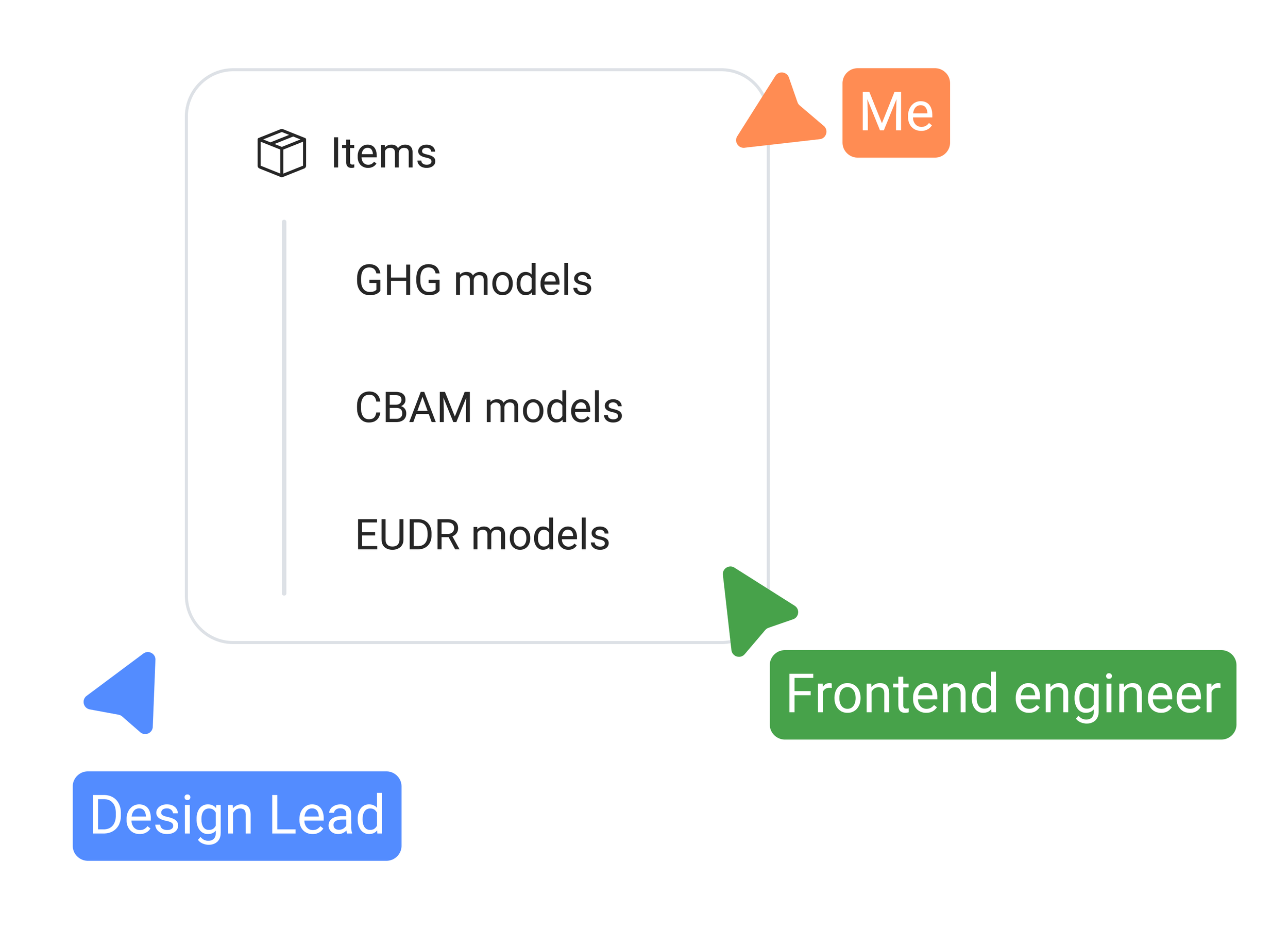
Navigation Rework is one of my favorite projects, since I initiated it myself after spotting real improvement potential in our existing navigation. The goal was to better reflect how customers and demo flows actually moved through the product, feel more guided, give our key USPs far more visibility, and bring the design up to a more modern standard. I led the project from the design side while also taking on a PM-style role, aligning direction with the team, with design feedback shaped together with our Design Lead. Once we landed on a direction, a frontend engineer implemented it within a single sprint.

Target Users & their Problems
The target users for this project were both internal and external: team members demoing the platform to prospects, and the customers using it day to day.
Through working closely with both groups, we identified the following problems:
Internal team members running demos moved back and forth through the navigation constantly, because many of the platform's core functionalities weren't reflected in it at all. "Items", for example, was a single navigation entry, even though it held several tabs covering different core regulations, key parts of the product that were regularly demoed but never actually visible in the navigation itself.
Both internal and external users ran into the same underlying issue: important, frequently used functionality was hidden or missing from the navigation, meaning reaching the right place often took excessive back-and-forth clicking.
As a leading B2B SaaS platform, the navigation's visual design had fallen behind the rest of the product and needed to be brought up to date and aligned with our newest design system. This also meant rebuilding the navigation component in Figma itself, since the existing one wasn't scalable enough to support the redesign.
The target group was effectively everyone touching the platform, internally for demos, externally for daily work, all of whom needed their most important workflows surfaced clearly, with less friction, and a navigation that finally matched the rest of the product.
Research
Internal Interviews
“We are promoting features which we don’t really support anymore on the top of the current navigation.”
“Currently inside demos the navigation doesn’t have a “correct” order.”
“Customers often ask questions about features which we have as they don’t see it in the navigation”
Ideation & Concept development
We compared three states side by side: the old navigation, including its hover and active states, an early exploration that leaned into more color, and the final direction, built mostly around shades of gray.
Adding more color was actually my first instinct, but after discussing it with our Design Lead, we scaled it back. The navigation shouldn't compete with the main content for attention, it should support it, and gray tones let it stay clear and well-structured without pulling focus away from whatever the user is actually working on.
"Items" was a clear example of this problem: it showed up as a single navigation entry, while the page itself held several tabs, like GHG and EUDR, some of our biggest and most demoed packages, none of which appeared in the navigation at all. The challenge was surfacing that level of detail without overwhelming the navigation.
Our first idea was a simple expandable dropdown: clicking "Items" revealed its tabs underneath, and clicking a tab jumped straight to it on screen. The second iteration made the relationship more visually explicit, drawing a line from "Items" into each tab beneath it. For the final decision, we pulled back again, landing on a subtler gray line, a pattern familiar from platforms like GitHub or Reddit, that still suggests what sits under "Items" without demanding attention. The whole section became collapsible within the navigation, so users could show or hide it depending on what they needed.
Bringing everything together, we restructured the navigation around what actually mattered most to users and to demo flows. Items promoted to the top were the ones users and prospects needed quickly and often, our key USPs; features we support less, or plan to phase out, moved further down, reversing how they'd been prioritized before. We regrouped sections so they made more logical sense together, kept the actual user flows in mind throughout, and made entire sections collapsible.
"Setup" (previously "Settings") is a good example: something a user typically configures once with their CSM and rarely touches again. Instead of taking up permanent space, it can now be collapsed out of the way, no longer competing for attention it doesn't really need.
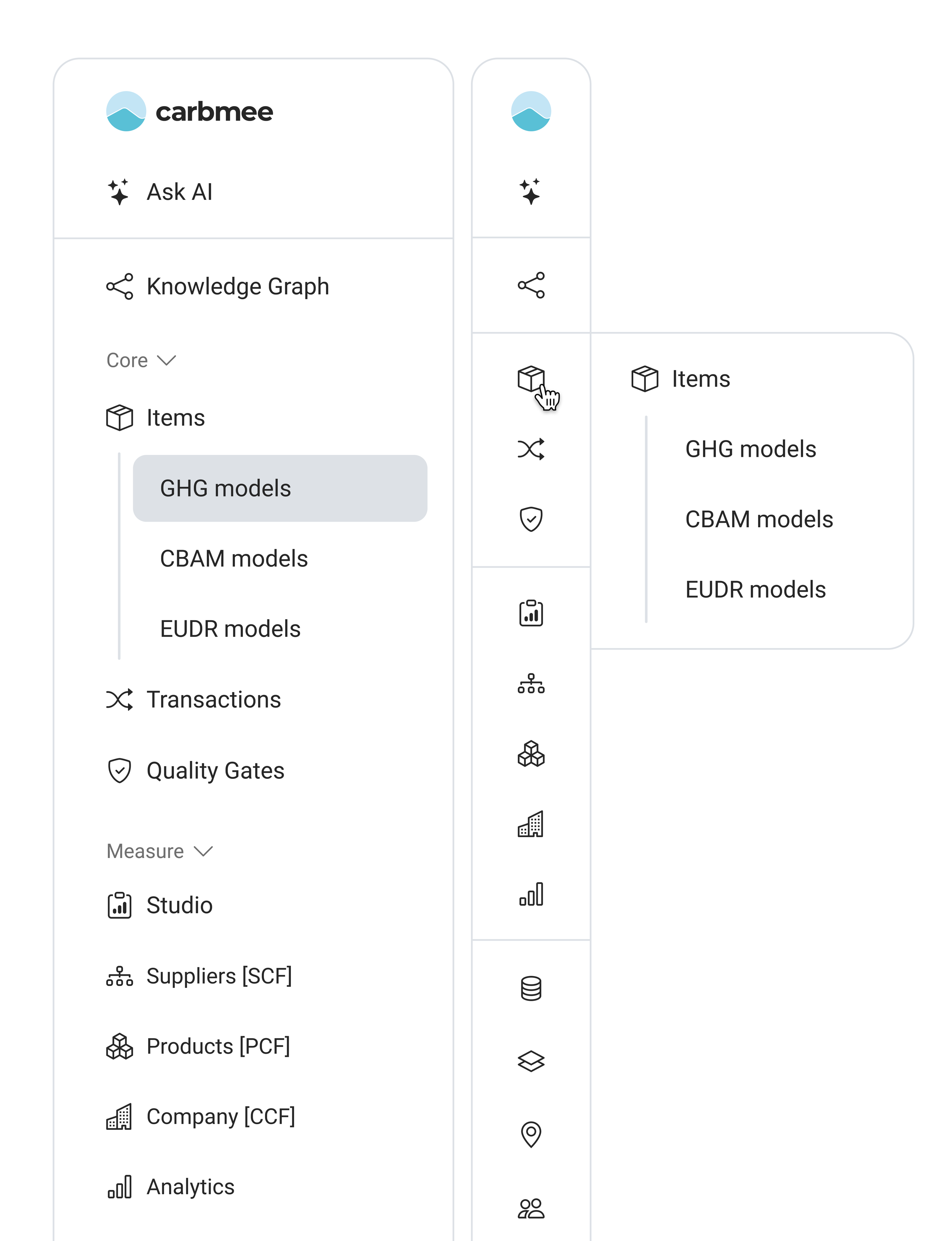
For the collapsed navigation, sub-items like the ones under "Items" surface through a flyout menu on hover, rather than being shown directly. Displaying icons for each sub-item there would have broken the pattern, since none exist in the expanded view, and would have made an already tight space feel cluttered. After looking at how other established software products solved the same problem, we adapted a flyout pattern that stays simple and reachable, one that scales easily if we need to nest sub-items under other navigation points in the future.
The final designs for the first iterations
The final navigation reflects everything above: a restructured hierarchy with our key USPs promoted to the top, logically regrouped sections, and collapsible areas like "Setup" tucked out of the way. It's shown in two states, expanded, with the new grouping and highlighted user flows visible, and collapsed, which saves space while staying fully functional through a flyout menu that appears on hover, keeping every destination just as reachable as before.
Further potential improvements
Beyond this iteration, we sketched out a more fundamental restructuring, though only as a concept, not something we implemented, since it would have gone well beyond this project's scope. Functionality tied to our core regulations (GHG, EUDR, and CBAM) was spread across the platform in fragments, "Transactions" alone was split into separate GHG, EUDR, and CBAM entries, with more of the same pattern repeating elsewhere. There was no single place to go if you just wanted everything related to, say, GHG. The idea was to give each regulation its own dedicated navigation entry, bundling every related feature underneath it, so users could find everything relevant to one topic in one place instead of hunting across the platform.
Want to see more? Click the button to get redirected back to the ‘Case Studies’ Overview!