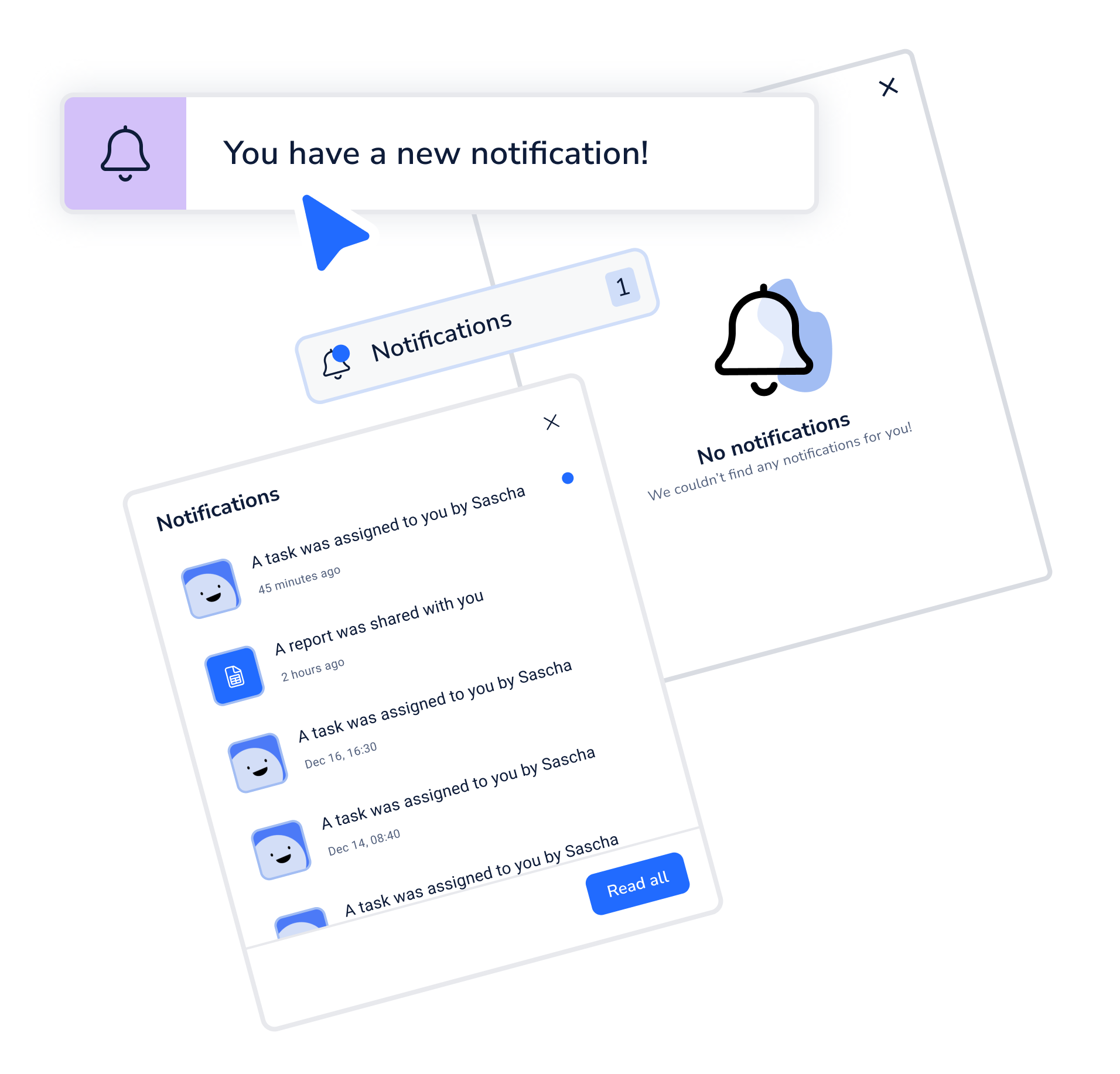
Notification Center
Case Study
Problem Statement
“How might we improve our product so that our customers are more successful through increased efficiency by direct communication, bundled with more feedback from the system on their daily work?”
Goals & my role
After a discovery research phase it was clear to us that the software is missing key structures to communicate properly with it’s users. Often the same UI components for software communication were used without any strategy behind. The goal was clear:
Create a scalable communication strategy for the platform, establish a ‘Notification Center’ & provide notifications which are currently missing for the users.
I was the Product Designer in the team and together with the Product Owner responsible for leading the project, planning, designing and implementing it together with the whole team.

Target Users & their Problems
Over some time customers reached out to the support team in regard of missing notifications for the users. This feedback was captured over the years in YouTrack Tickets.
Through some fruther in depth research with our customers,
we discovered following problems:
Too many tools are being used and needed for communication on the Shopfloor. There are no rules or structure behind, mainly because of the rushed introduction of such tools through the times of corona.
Different users have different preferences when it comes to what they want to be notified about and what’s important for them. Requirements from their management might also be important for this point.
Our platform is lacking a good communication to its users. Many notifications are missing, often the same UI components were used as there as no real strategy behind on when to use which components. There is also no space to collect such notifications.
The target group were definitely the Shopfloor workers and everyone actively working with the software on a daily basis. To enable them to be efficient in their work and reduce errors through miscommunications, these problems had to be solved.
Research
Maze Survey
12
YouTrack Tickets with customer insights to this topic
3 out of 5
The status rating of the internal communication
21
Customers with already custom build & set up notifications
0%
Have an existing communication system connected to Operations1
100%
Agree that it is necessary in their daily work to communicate with each other
75%
Have experienced already a negative impact due to missing communication
Research
Interviews
“We need a chat function from user to user & assignment of tasks to multiple users.”
“Our users should be able to select themselves which notifications are important to them”
“Desire for a uniform and structured communication within an area of responsibility”
“As few communication tools as possible. Clear standards, which tool for which communication. ”
“Rework or complaint due to missing technical specifications, unavailability of relevant persons...”
User needs
-
Our users need as little communication tools as possible. It should be clear when to use which tool for which purpose.
Our goal -> to become THE communication tool on the shopfloor! -
Through the research we found out that different customers have different preferences when it comes to the customization of notifications. To solve this we want to implement a customizable notification profile which can be changed if you have the permission for it.
-
Our users are missing some important notifications in the system which are relevant for their efficient and fast paced work. These types of notifications were already collected in the earlier YouTrack Tickets.
Competitor Analysis

SafetyCulture
Features
—> Implemented a custom feature called ‘Heads-up‘. A big notification which comes up as soon as you open the app. You have to read and confirm the notification.
—> They already have a notification center implemented which shows any new and past notifications for each worker.
MaintainX
Features
—> They also have a notification center implemented which shows any new and past notifications for each worker.
—> You can customize these notifications in the settings depending on your preference.
—> They have a full communication center implemented where you can create 1:1 chats with colleagues and groups with multiple users.

Tulip
Features
—> They have several notification integrations possible with Teams, SMS, E-Mail etc.

Lumiform
Features
—> They also have a notification center implemented which shows any new and past notifications for each worker.
—> They have custom push notifications enabled for their mobile app.
Ideation & Concept development
As I found this topic interesting and knew it would come up sometime in the future, I already did some research and designs in my learning time. For a designer it is a nice topic, especially when nothing in this area was tackled before. No technical limitations, lots of design freedom and crazy ideas.
Some of these ideas found themselves being quite useful even after the actual customer research and it was a solid foundation to build on. Our goal was clear, the research was there, so it was time to ideate. Not only for the first iteration but where we want to be with the topic ‘Shopfloor Communication’ in 2-5 years. We held several workshops to find out where we stand right now and where we want to be end of the year and the following years. Some first ideas were made and wireframed by me.
The placement of the button to access the notification popup is a key decision. There were two different approaches which were mainly discussed.
To integrate the notification center inside the existing Dashboard, as it’s already build up by different blocks and the notification center could be an additional one. As the dashboard is relevant anyway for workers to check their daily work and open tasks, they could also immediately check open notifications.
Integrate the notification center inside the main navigation bar as a separate point close to the user profile button. After research this seemed like the most intuitive position for most people but would require more frontend work in the end.
Placement of the notification center
As we were introducing and building our design system in parallel, it was very fast to build a first prototype with our current components. Only some new ones needed to be introduced to cover the UI for this topic.
The state of the art for a ‘notification center’ was also quite clear, so the first designs were made in this direction. To solve the problem of “different users have different preferences in tearms of notifications” we decided to introduce a new page called ‘Notifications” in the User Profile, where each user with the permission can change the types of notifications they want to receive through different channels.
In the end I decided for the second approach as the separate navigation point proofed to be the most intuitive and user friendly option. The Dashboard idea is not bad but it’s not flexible and badly scalable as the Dashboard itself could already need a rework on it’s own. As a separate navigation point we leave a lot of room for additional features and scalability of the feature. It can be accessed from anywhere as long as the main navigation bar is visible, can immediately show how many unread notifcations a user has and can later expand into it’s own separate page more easily (to maybe integrate a news feed, ‘heads up’ messages from management etc.)
The final designs for the first iterations
New navigation point
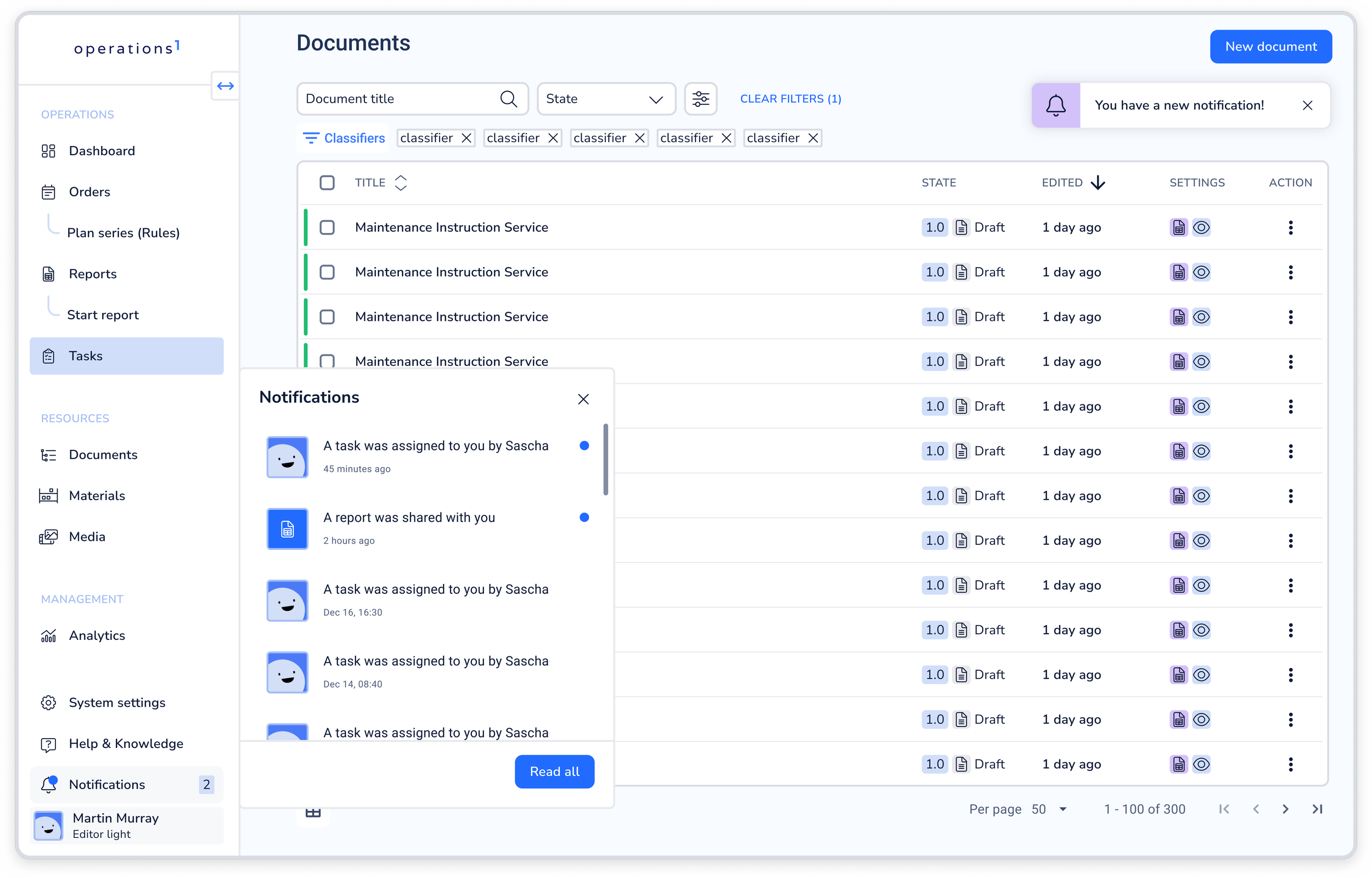
Placed on top of the profile button, the user can easily reach the notification center. It shows how many unread notifications the user has and updates real time. For the collapsed state the user can still see if he has unread notifications through the indication of the blue dot on the icon.
The same principle applies for the mobile version.
Notification Center Popup
Once upon clicking on the navigation point, a small popup opens up next to it.
There we are showing an empty state if they are no notifications, otherwise the different types of notifications are being shown. If they are new and unread, they are highlighted with the blue dot next to it. Once the popup is fully filled with notifications, the popup becomes scrollable.
With a primary button the user can quickly set all new notifications to read.
Later on we might introduce a different kind of pagination with a tab for “Read” & “Unread” and a functionality to set read notifications back to unread.
Notification Center Toast Message
To further inform our users better about new notifications, we introduced a new state for the toast component connected to the Design System project. Once there is a new notification, the toast message automatically appears in real time. This way the user is informed about it, no matter where he is in the platform. The toast disappears automatically after 3 seconds.
Custom Notification Profile
After research it was clear that our customers and users want to customize the notifications their shopfloor workers receive. There are different preferences so to accomendate everyone, we introduce a new tab in the users profile where you can customize what types of notifications you want to receive and in which way.
The second iteration
New functionalities
During the research some ‘state of the art’ functionalities were quite clear. One of them was to be able to set single notifications to read, without the need to open them. To achieve this, we enabled the users to click the blue dot next to a new notification, to be able to set it to read. The hitbox is also 8px on each side bigger than the actual visible dot.
New notifications
To further expand the notification center we introduced several more notifications which are interesting for the user to improve the speed and process of resolving tasks on the shopfloor.
We introduced a notification for state changes within a task and when it is/close to being overdue. Visual cues which the users already know were being reused here.
New plans for further iterations
After several weeks of the feature being available for our customers, we checked the data we had to see the adoption. Most of our users which are actively working with tasks are using the notification center now to help them resolve tasks faster. On average, the notification center is being clicked 40-80 times each day, and that with only a few notifications within a single area available.
I have also written and published an article about the communication strategy on Medium.
If you are interested, feel free to read through it by clicking on the button below!
Want to see more? Click the button to get redirected back to the ‘Case Studies’ Overview!