Product Carbon Footprint - Rework
Case Study
Problem Statement
“How might we rethink Product Carbon Footprint from the ground up so that it truly aligns with how our customers work with it and share it with their own customers, bundled with the regulatory requirements needed to keep it ISO-compliant?”
Goals & my role
The goal was to rebuild Product Carbon Footprint from the ground up so it truly matched how customers worked with it, shared it with their own customers, and stayed ISO-compliant throughout. I was the lead designer on the project, working closely with our Senior Product Manager and the wider engineering team, including an Engineering Lead and several full-stack frontend and backend developers. It was one of the largest projects I've worked on, running for close to a year across many iterations, with scope continuously refined through research alongside the PM. Collaboration with engineering went well beyond a typical handoff, extending into technical improvements and how the underlying PCF calculations themselves were structured.

Target Users & their Problems
Target users for this project were both our internal LCA (Life Cycle Assessment) experts, who build and maintain PCFs for our customers and hold deep domain knowledge, and the customers themselves, who receive and need to understand these PCFs.
Through working with both groups, we identified the following problems:
How PCF calculations actually worked was highly intransparent. Only internal team members could really follow the logic, even LCA experts on the customer side struggled to understand what was being calculated and how.
The interface was affected by numerous UI bugs that significantly hurt usability.
The existing approach wasn't scalable: highly complex PCFs would regularly break the UI entirely.
Many functionalities were missing outright, and the ones that did exist no longer fit current design patterns, since most of what was on screen hadn't been touched in years.
The target group spanned both our internal LCA experts and the customers relying on accurate, understandable PCFs, all of whom needed a tool that was transparent, usable at any level of complexity, and up to date with the rest of the platform.
Research
Survey & Interviews
75%
Agree that core functionalities are missing
2 out of 5
The rating of customers for the PCF module
12 out of 15
Enterprise customers are actively working with PCFs
25%
Have even self-made solutions and features build on top of our PCFs
85%
Agree that the UI/UX of PCFs feel different compared to the rest of the product
64%
Of customers don’t understand how their emissions are being calculated
User needs
-
Both internal LCA experts and customers needed to actually understand how a PCF was calculated, not just see the end result. This transparency mattered not only for trust, but to keep PCFs ISO-compliant and defensible once shared further down the value chain.
-
Users needed an interface that held up regardless of how complex a PCF got. The previous version was affected by numerous UI bugs and would break entirely under complex, real-world PCFs, exactly the cases where reliability mattered most.
-
Users needed functionality that had kept pace with the rest of the product. Several features were missing outright, and the ones that did exist no longer matched current design patterns, since much of the experience hadn't been touched in years.
Ideation & Concept development
Scalable and user friendly tablelist
The first major decision was moving away from cards toward a flat list, paginated as needed, with an endless scroll pattern that could support real filtering and scale far better than the card-based approach ever could.
That raised a follow-up question: with a potentially huge amount of data, how should users navigate through it efficiently? We considered a separate side navigation for different sub-sections, as well as splitting the view into tabs so users could focus on just the data or just the emitters they needed at any given moment.
In the end, we chose the flat list for its scalability, performance, and usability, search and filtering worked far more naturally within it. For navigating within the list itself, we started with a solid search and filter foundation first, and deliberately held off on building a more complex navigation layer on top until we could validate against real user needs.
Representing the tree structure
A PCF is built on a Bill of Materials that can be deeply nested, items inside items inside items, mirroring how a product is actually assembled. The question was how to represent that hierarchy clearly within a complex BOM: through indentation, numbering, expandable and collapsible rows for more user control, or by keeping the flat list and adding a dedicated column just for hierarchy level.
We landed on the dedicated hierarchy column. It was the simplest and most scalable option, didn't break down once a BOM reached ten or fifteen levels deep the way indentation risked doing, and was fast to implement while already covering most user needs. The plan was still to eventually offer a separate, indentation-based view users could switch to for a clearer sense of structure, each approach had its own trade-offs, but this was the right starting point.
Showing the calculation
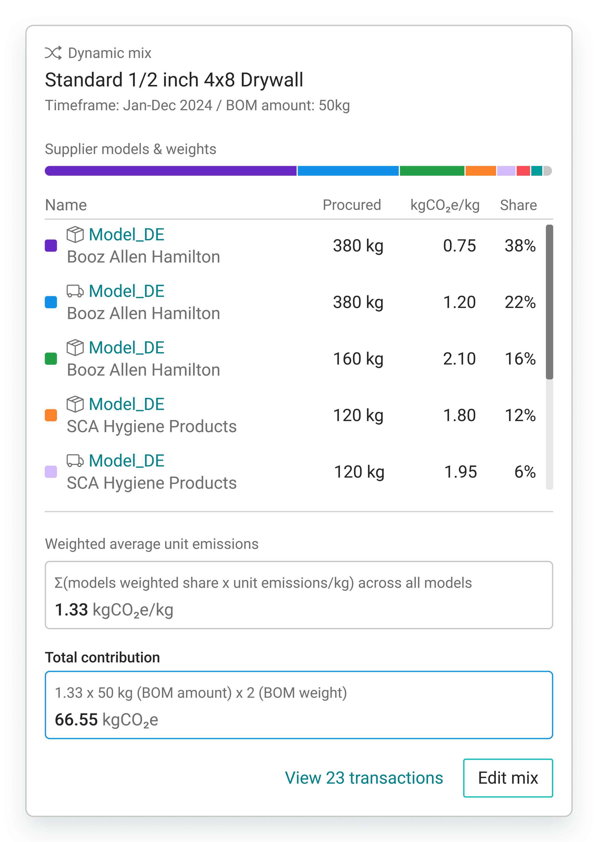
Alongside significant backend changes to make emissions calculations more precise and ISO-compliant, a key user need was surfacing how those calculations actually worked in the UI. The challenge was representing genuinely complex formulas in a way users could still quickly understand, and ideally edit afterward: which models or suppliers factored into the mix, and what had actually gone into production.
We landed on a calculation popup that shows how the current mix and resulting calculation come together for a given item, paired with a separate edit flow where users can select a different model or supplier, or adjust values manually, to make sure the final emissions figure is fully accurate.
The final designs for the first iterations
From cards to a flat table
The final design moves from cards to a flat, searchable table with configurable columns, users can turn columns on or off depending on what they actually need to see, with these preferences saved per user. This level of flexibility didn't exist before, and lets each user tailor the view to their own workflow instead of working with a fixed layout.
PCF Variants
We introduced a new intermediate layer called variants, something heavily requested by customers: a single product can have one PCF, but multiple independent variants underneath it, each editable on its own. This reflects how PCFs actually get shared with customers over time, capturing emissions as they stood at a particular point. If something changes later, like a supplier switch, a new variant can be created and shared, without overwriting or losing the version that came before.
The hierarchy column
Inside the PCF view itself, the tree structure lives in its own hierarchy column, mirroring the layout of the Excel BOM users upload, so rows can be expanded or collapsed individually wherever there are deeper levels underneath. We also added global expand and collapse controls, letting users open or close every level with a single click, a feature that came directly out of user research interviews and turned out to be a quality-of-life win: many customers found it especially valuable for staying oriented in complex PCFs, whether that meant drilling into specific branches or getting a quick overview at just the first hierarchy level.
Lifecycle phases
Previously, lifecycle stages were separated into different card sections. In the new design, they're shown more prominently through a dedicated column with color-coded nuggets, so users can immediately see which lifecycle stage any given item belongs to. A separate display settings menu, which later expanded to cover more display options, lets users toggle stages on or off depending on what they need to focus on, with these preferences saved per user just like the table columns. That gives people the flexibility to either see everything at once or narrow in on a specific lifecycle stage they're currently reviewing.
Dynamic Mix
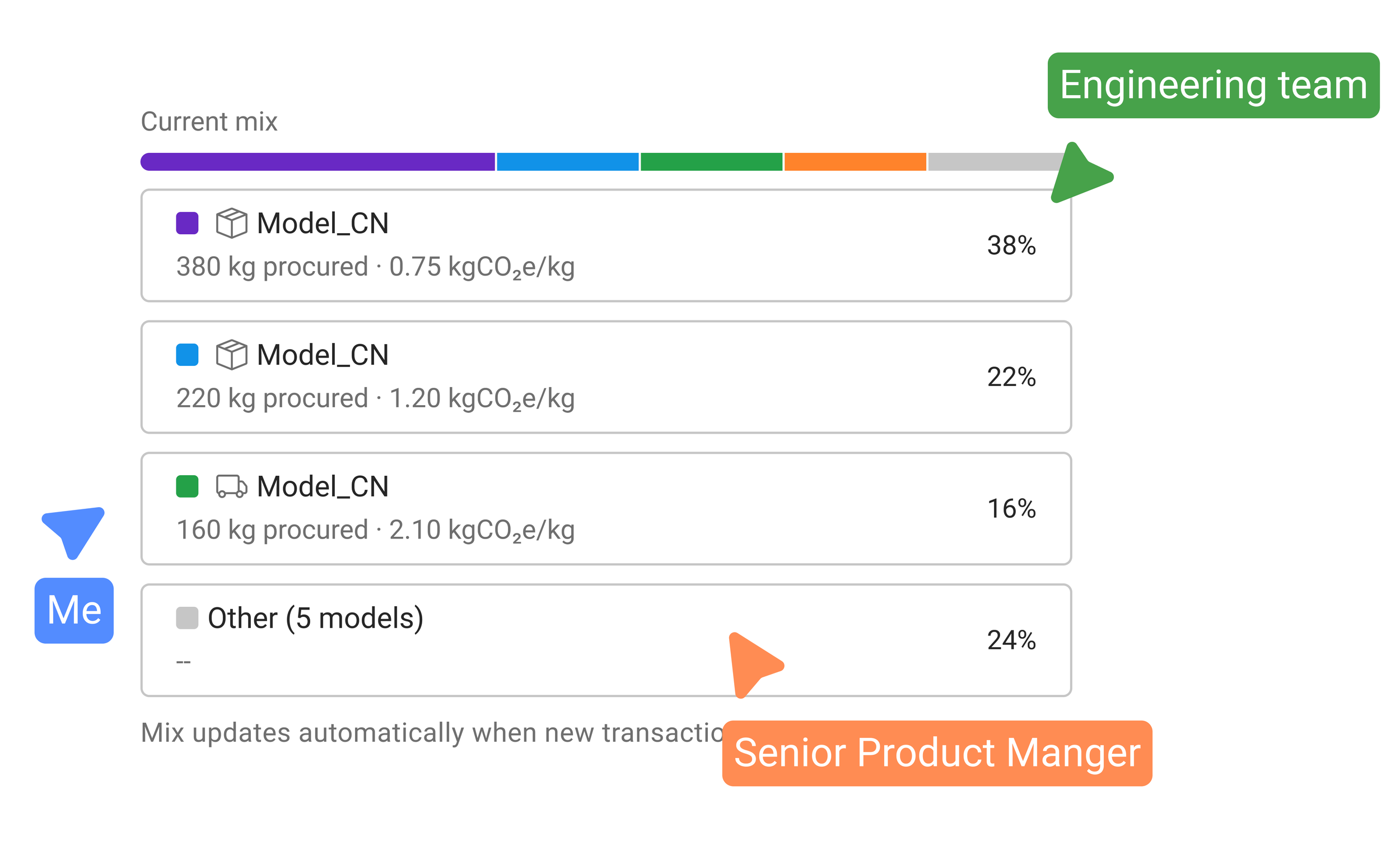
Dynamic Mix is a new concept developed together with engineering and our Product Manager, one that reflects production reality far more closely: items are typically built from multiple deliveries, models, or materials across different suppliers, something the previous calculation couldn't account for. Using data we already had from customers and their production, we could calculate precisely how much of which model factored into an item's emissions, and surface that transparently back to the customer, with the option to drill into transactions for more detail. Users can also edit the mix directly: staying with the calculated Dynamic Mix by default, choosing a single model, or selecting a supplier to include only their models. It became one of the most requested and best-received features we shipped, backed by extensive user research and a substantial engineering migration behind the scenes.
Want to see more? Click the button to get redirected back to the ‘Case Studies’ Overview!